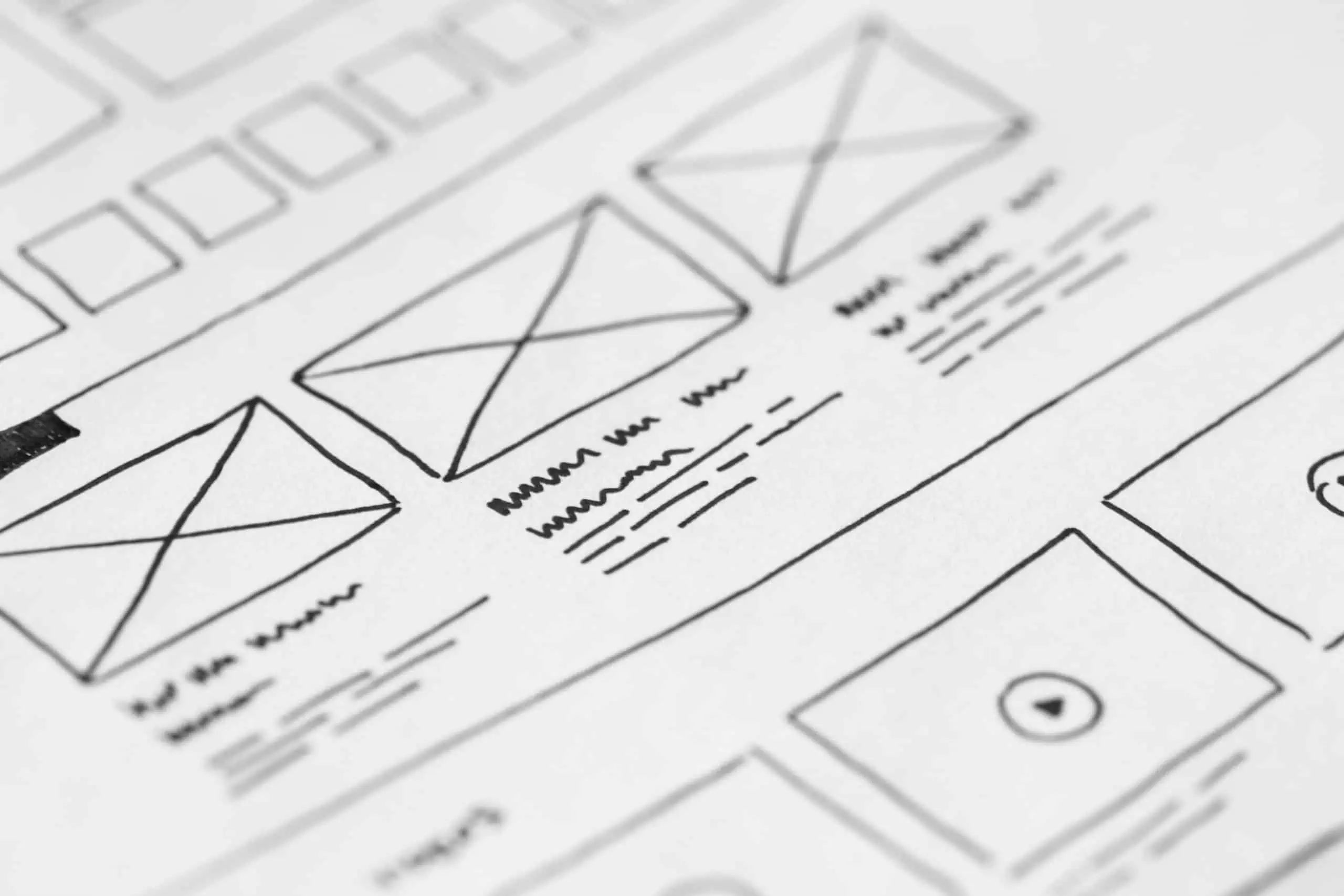
How good are your briefs? Creating a good web design brief at the start is the foundation for getting a great final result out at the other end but, it’s not as easy a task as it sounds. There is actually a lot to think about when creating a brief – because you have to determine what it is that you want to come away with, and that means making some big decisions.
Web design is part art and part science, but it is also about solving problems. Every business is unique and has a unique audience it wishes to reach. As such, a web design and development project is only really a success if the end product solves the problems of that business and those of their customers. To get to this, it’s all about the brief.
As a web design agency, we have of course seen our share of good and bad web design briefs. So, we’ve put together four of our most useful tips to help you write a cracking brief for your next web development project.
Start at the Beginning
It may be that you’re having a website designed and developed by the same agency or partner who designed your branding strategy and marketing materials. You may have a website that is in desperate need of a redesign rather than starting from scratch. Either way, it is important that when it comes to your website design brief, you start at the very beginning.
Understanding your business, its purpose and its general branding proposition is of vital importance to your web designer. If they do not entirely understand your business model, they aren’t going to be best positioned to guide you through the creation of what is ultimately going to be one of your most significant business assets.
Who are you and what does your business do? Answer this question so your web designer understands your business as well as you or any of your employees would do.
Who’s the Audience?
Leading on from understanding your business, the designer needs to know who he’s building the website for. Yes, he’s building it for you, it’s your brief, but you aren’t building it for yourself, you’re building it for your audience. It’s not just about making something look ‘pretty’. It’s about solving a problem for a specific customer.
Fully brief your designer on the details of the demographic group the website is targeted at. Who do you want to visit their website? What do their lives look like? What is the problem your business solves for them? If you are unsure about any of these areas, then you’re not ready to brief a designer yet. The finished product needs to represent something that would appeal to your target audience. Understanding who it is that is likely to use and interact your site has a big impact on decisions such as navigation structure, colours, text, functionality, images and a whole host of other nuts and bolts so, including them in your briefs put your designer in a position to bring each element together in a way that makes sense to your end user.
What is the Desired Function
What do you want this website to do for your customers? What does the site need to be able to do in order to facilitate this? It might be providing information. It might be to allow the sales of a physical product. It might be the delivery of a virtual product. What ever the main objective of the website it is, it should be clear.
It is likely that you will have multiple objectives for your new business website. Break this down into a primary objective and then secondary objectives. As an example, a primary objective may be sales and general e-commerce. A secondary objective would be to inspire email newsletter subscriptions or brochure downloads. Plot these functions clearly in order of priority to the business so the designer can adequately reflect this.
Do Give Examples You Love and Hate
However poetic your brief may be, nothing quite compares to seeing your likes and dislikes in the flesh. You should absolutely include examples of websites you admire and detest as part of your brief. It’s not cliché, it’s actually a very useful part of the process, particularly when it comes to how your website looks and feels.
An additional tip here: it’s all well and good giving a big comprehensive list of likes and dislikes by attaching a plethora of links. But in reality, the best thing to do is avoid this approach. Instead select a handful for each column and provide the link but support this with an overview of why you like or dislike the website in question. Don’t leave anything to assumption; tell the designer why you hate it so they know what they’re looking at.
Ultimately, it’s important to remember that the best web design agencies (like us!) will be more than happy to assist you through the briefing process if you’re not confident in tackling it solo. But, it never hurts to be prepared and even if this is the case it’s still best to have gone through at least a loose self-briefing process. This way you’re not answering questions on the spot for the first time. The chances are most of these elements you will have considered prior to a briefing session.
Need more help? We love helping businesses turn their ideas into a fully functioning, highly performing new website. Contact our web designers now to get the ball rolling.


